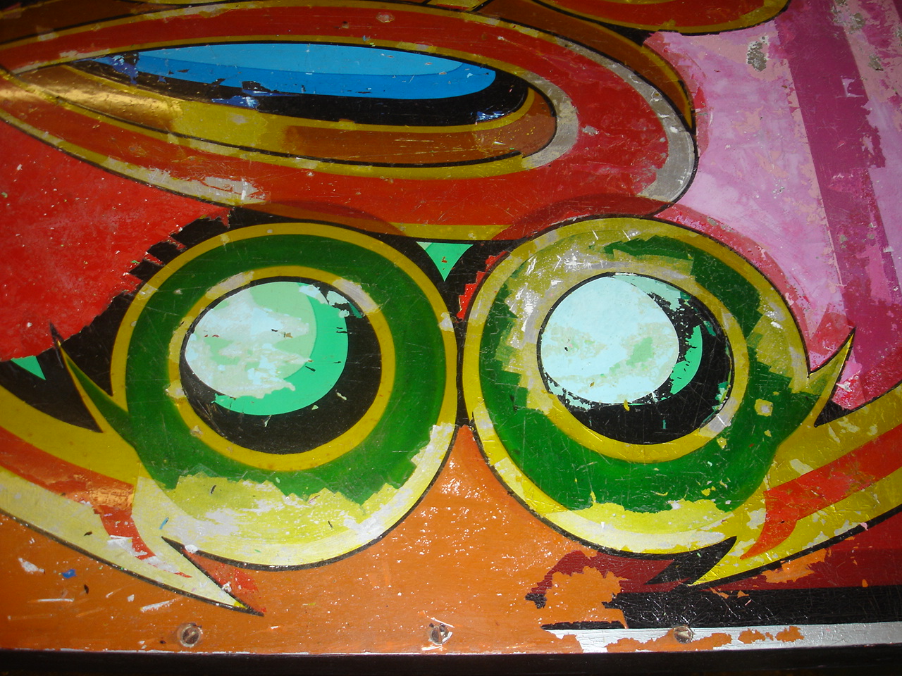
Specs76 has done the world a huge favour by uploading this magical 1975 Arts Council documentary on Fred Fowle, the master fairground painter. Fred comes across as charming and self-effacing, and his old mentor Edwin Hall - another towering figure in fairground art - turns out to be an absolute scream.
We get to see some of Fred's psychedelic work, which is equal to anything from the West Coast, despite having being done by an old chap in a tram shed in greyest Balham. But his most original style, also shown here, involved bringing together abstract modernist geometry and illusionistic space influenced by Fred's obsession with Sir James Thornhill's Painted Hall at Greenwich. It's a treat to see him at work on these creations, which oddly sometimes predict the Turner Prize-winning work of Tomma Abts(below).
In a recent Guardian article, John Hooper summarizes the Italian press's conceptual salvaging of the wreck of the Costa Concordia: the ship becomes a metaphor for Italy itself; its Captain a double for Berlusconi, the cruise ship crooner-turned Prime Minister. And in her book on Vladimir Putin, Masha Gessen writes that the Kursk nuclear submarine disaster 'makes an easy metaphor for the post-Soviet condition'.
This brings to mind an earlier act of rhetorical commandeering, in Phil Ochs's 1969 song, "The Scorpion Departs But Never Returns". Here the sinking of the USS Scorpion submarine the year before is the starting point for a poetic statement of Ochs's personal disillusion, and his pessimistic vision of America at the end of the Sixties. Ochs doesn't make straightforward comparisons like those above, instead leaving several layers of significance to shift in and out of focus.
Like much of the album Rehearsals for Retirement, "The Scorpion..." deals with Ochs's loss of faith in politics and protest following his experiences at the infamous 1968 Democratic Convention in Chicago: "The crew has turned to voting, and the officers to drink..."
"Captain, my dear Captain..." paraphrases Whitman's poem in praise of Lincoln, also echoed in the metre of Ochs's verses. Throughout the song there are several cinematic shifts in perspective and scale that encourage a symbolic reading, at the same time as destabilising its coherence: from the sea to the personal effects of the crew; from the ship itself to a toy in the kitchen sink. The descending chords in the verse have an obvious significance.
When Ochs repeats the refrain, 'I'm not screaming', he's both renouncing his old techniques and touching on the reason for the song's lasting potency. This is observation rather than protest, the tone is melancholy, the 'message' ambivalent and opaque. Ironically as this introverted response to injustice replaced the outrage of old, his writing dried up. In the seven painful years that remained to him, he only recorded one more album of original material.
As recently as the 1980s, poster or "ticket" writing was a staple of signwriters everywhere. It's a measure of how much we've changed that this form of advertising, once seen as the quickest and most economical way to get timely information across, now seems unwieldy, and much more of an undertaking.
from Pen and Brush Lettering and Practical Alphabets, Blandford Press, 1952
As the name suggests, the "One-Stroke" style honed in the 40's and 50's to suit this ephemeral, quick-turnaround work, has been stripped of serifs and other extraneous elements. Its dynamic effect relies on fast, fluid execution and parallel, chisel-ended verticals.
Although its form is governed by utility, one of the joys of coming across this lettering is in detecting the hand of the maker; the small flourishes, eccentricities or deviations from the norm that are inevitable when a human hand is involved. As Emerson wrote, 'Though he were never so wilful... Man cannot wipe out of his work every trace of the thoughts amidst which it grew.'
Nowadays the One-Stroke letter awaits our appreciation in front of neglected bastions of civilization like churches of obscure denomination, or cut-price shoe shops. I was surprised and delighted to find the details of weekend engineering work at New Cross Station brushed with great panache, manicules and all. In black on fluorescent yellow card, perhaps drop-shaded in red, the aesthetic violence of the style remains undiminished (Onward Christian Soldiers; Prices SLASHED!). If we sense that it comes from another time, this only adds to the arresting effect.
Christmas poster at Stoke Newington Baptist Church combining poster lettering with a traditional grotesque face for compactness and readability.
Another moribund font commemorated here by Phoebe Blatton.
The exhibition of Joe Orton and Kenneth Halliwell's doctored library books continues at Islington Museum until 25th February. Displayed alongside all of the surviving covers are diaries, ephemera, and photographs of the couple's bedsit at 25 Noel Road, beautifully decorated at Islington Borough Council's expense:
For me one of the highlights of the show was a tangled and obscene jacket synopsis for a Dorothy L. Sayers book that ends with the reader being exhorted to enjoy it behind closed doors, 'and have a good shit while you are reading!' Orton recalled, 'I used to stand in the corners after I'd smuggled the doctored books back into the library and then watch people read them, It was very fun, very interesting.'(Joe Orton Online)
I was fascinated to learn that the two prime suspects were eventually caught by Sydney Porrett, a cunning and assiduous senior clerk with Islington Council, who hatched a plan to send a letter to Halliwell asking him to remove an illegally parked car. "I had to catch these two monkeys," said Porrett in the contemporary idiom, "They were a couple of darlings, make no mistake." The typewritten reply, stating that they did not own a car, matched irregularities in the defaced books, and the game was up.
Kenneth Halliwell, Untitled Collage, 1966
I was slightly disappointed that there were none of Halliwell's 'serious' works in the exhibition. Nobody took much notice of his baroque collages during his lifetime, which was probably a contributory factor in his murder of the more successful Orton, followed by his own suicide. But Halliwell's work shares a highly developed sense of colour and composition, as well as a camply subversive atmosphere, with his Californian contemporary Jess (below), and he deserves to be better known in his own right.